Here’s an image from an activity (WNBA Scoring Averages) that I wrote earlier this year.

When we dropped the activity into the search pool at teacher.desmos.com, I didn’t think it was a world-changer, but I was pretty sure it wasn’t untouchably awful.
Hang on a sec while I fire up our database to check how many times it’s been run since it arrived on the scene in May 2016 .
Seven, eight, carry the one… Round up for good measure… Almost there… Aaaaaand…
Zero. Zero sessions.
Needless to say, that’s not a lot of sessions.
So what went wrong? I’ll offer a few theories, and along the way highlight a couple of things that might be worth preserving. I’d also love to hear your thoughts on how to make this—and activities like it—better.
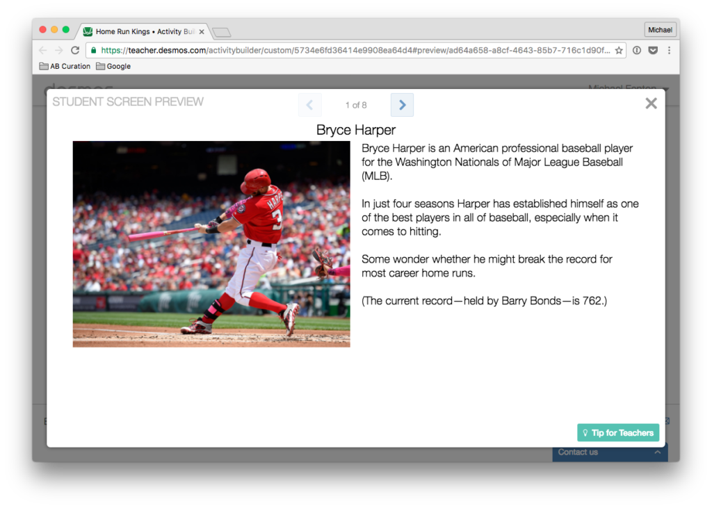
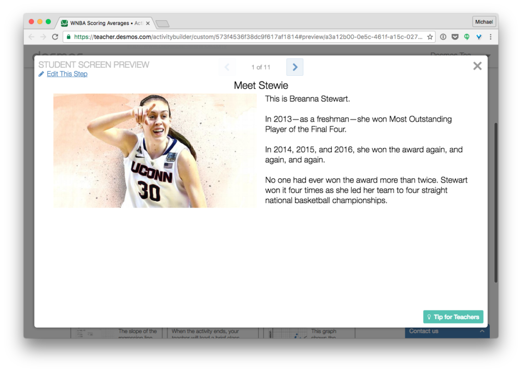
Screens 1-3
Bummer. 27% of the activity just to set the context. That’s killing my discussion-to-screen-count ratio.


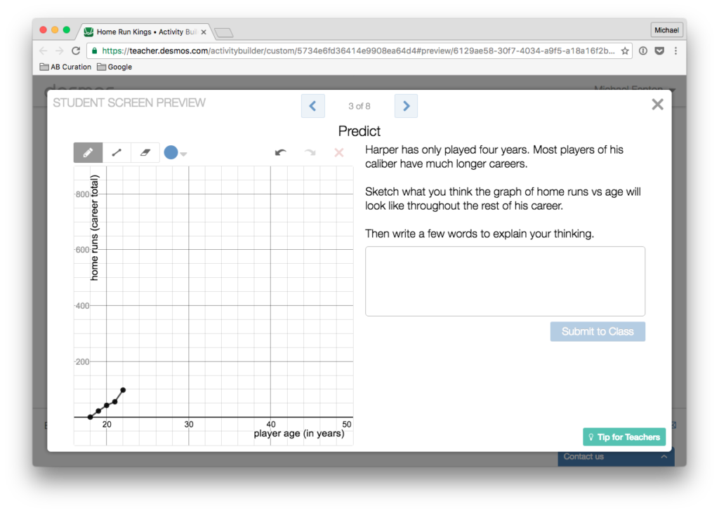
Screen 3 (above)
Before asking for a calculation, ask for a prediction. Nice!
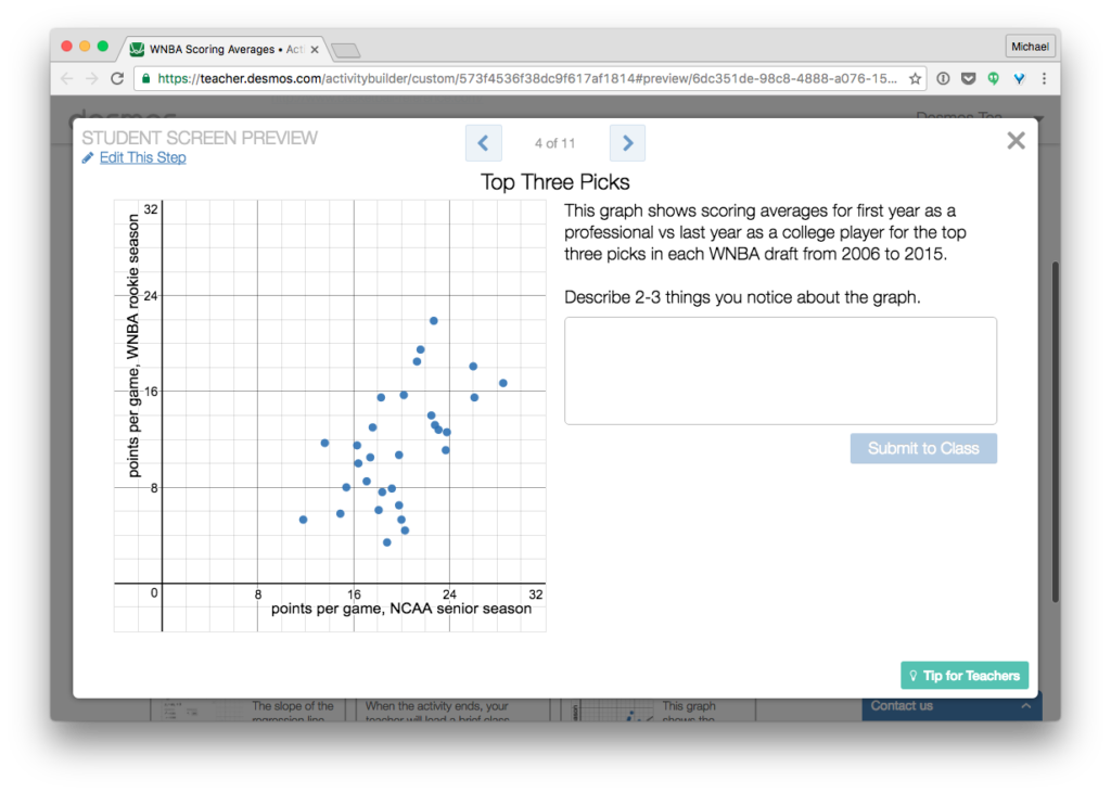
Screen 4
An opportunity for students to wrestle with the meaning of a scatterplot in a setting they haven’t seen a thousand times. Also, a chance for teachers to highlight interesting responses, starting with informal ones and progressing to formal ones. That being said, I can’t shake the feeling that nobody cares about the patterns they see on this screen.
Screen 5
This screen’s a mess. “The red point means WHAT? My original prediction? I can’t remember that!” And a purple point that I might move? This is just awful. (P.S. What’s the input field for on this screen?)

Screen 6
I can just hear the conversation now… Me: “In row 1, write the equation…” Students: “Why?” Me: “Because I said so.” That line hasn’t been working with my three year old twins at bedtime, and I don’t think it’s going to play out well in the classroom. There’s got to be a better motivation for plotting this line now, something beyond the “trust me, just do it” rationale I offer here. Maybe the solution is to skip having students enter the line, and just jump from Screen 5 to 7?

Screen 7
Continuing that thought… I propose deleting Screen 6, and revising Screen 7 to read: “(1) How do the points compare to the line y = x (shown in black)? (2) What does this mean in context?” Even still, I’m not sure how strong a screen that leaves us with.

Screen 8
“Boom, a line of fit! Now use it! ” This screen reveals a couple of major open question I have about modeling activities in Desmos Activity Builder. (1) Should students generate the line or curve of fit? Always? Sometimes? Never? I think “sometimes” is the right answer here. But I’m not clear (yet) on when it’s the right move. Here I offer it to students “for free” so they can focus on using and interpreting the line. But I’m not sure that’s the right move. (2) Many of the modeling tasks I’ve build in Activity Builder feel a little too linear and granular (as in, one tiny step, then the next tiny step, and another, and another, with all students moving through in the more or less the same manner and sequence). Is this the best approach? I doubt it. But what’s the alternative? I haven’t figured that out yet.

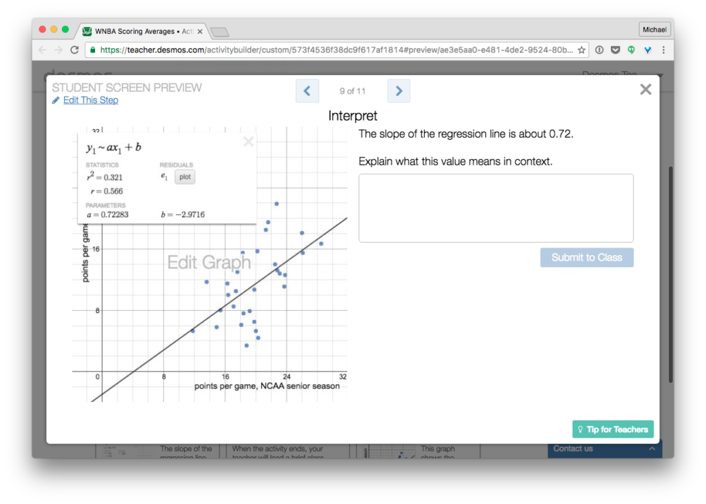
Screen 9
Interpret the parameters in context. Yay!? But—students had no role in generating that value, so it feels uninteresting to ask about it. I’m wondering about an alternative screen—or sequence of screens—where students use sliders to create their own line of fit. Then answer a question or two about the meaning of their parameters in context, ideally in contrast to a classmates’ parameters. Hm. Still feels lackluster.
Screen 10
I’ve thrown this discussion-prompting screen into a handful of activities over the last several months. Do you think it’s helpful? My hunch is that some teacher tips go unread, but a student-facing screen encouraging discussion at this point is sure to be noticed.
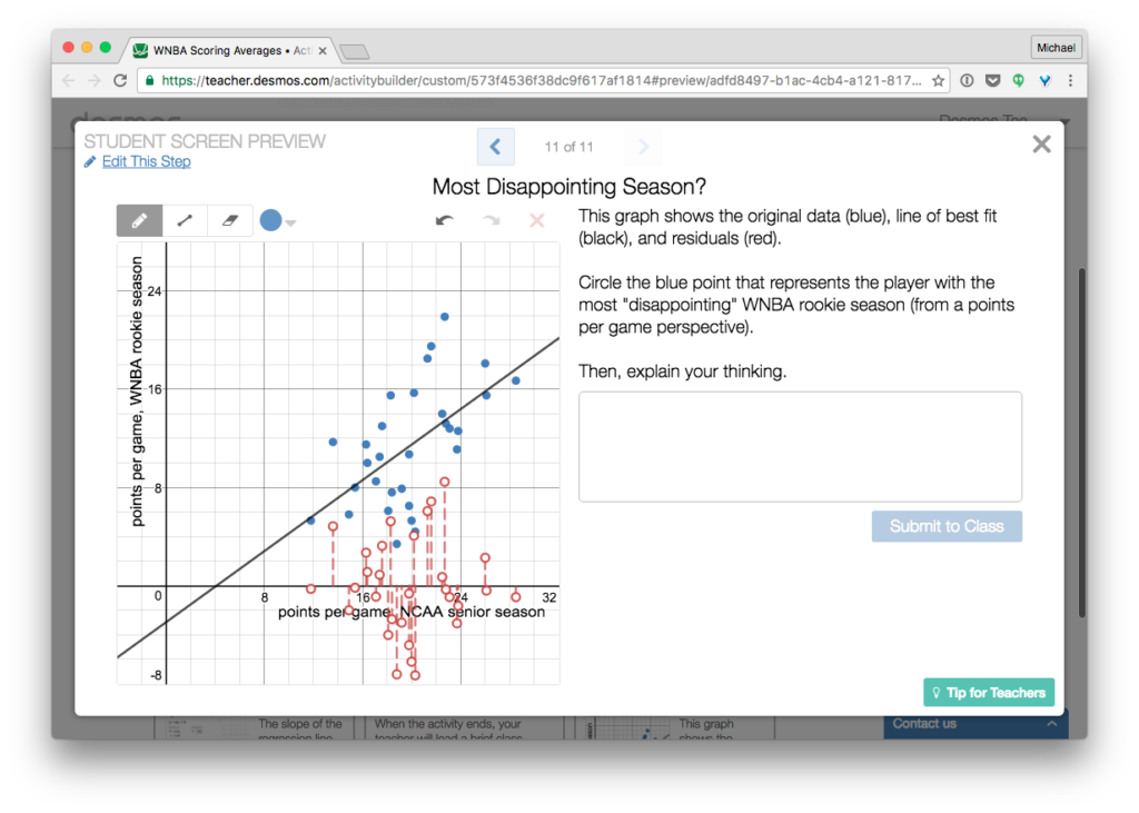
Screen 11
As was shared recently over on the Desmos blog, we strive to activities that are easy to start and difficult to finish. Low floor, high ceiling, etc. Extension screens are one small part of that puzzle, and I’ve dropped one in here to wring a little more value out of the context, and to spark (possibly) a conversation about residuals. I like this screen. At least I think so. I’d love to know what you think.
General
I’ve rambled a bit about what I do like, and what I don’t like. And in the latter, hinted at ways that I might be able to improve this activity. Unfortunately, even with those improvements, I don’t think this is a particularly strong activity. It lacks a compelling problem. There’s very little cognitive conflict, even with the predictions at the beginning. (Maybe I could hold those up at some point early on: “Here’s your prediction. Here’s all your classmates’ predictions. Let’s see who’s closest!” Or maybe not.) Students don’t have very many opportunities (if any) to be right or wrong in interesting ways.
Over To You
So what do you think? Is this salvageable? What does it suffer from in its current form? What strengths does it have, and how could we build on those?
Thanks in advance for chiming in!